CSS Settings

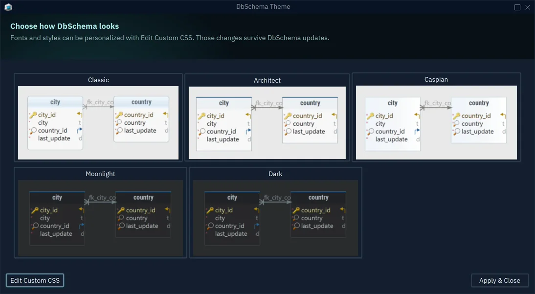
DbSchema's user interface is built with JavaFX and styled with CSS files. This page maps the colors that you see in the application to the CSS variables and properties that set them. It covers the Dark theme; the other themes use the same variable names with their own values.

Each screenshot carries numbered markers. The table under the screenshot explains each number: the area it points at, the variable or rule that paints it, the file where the value is set, and the value itself.

How the CSS Is Organized

JavaFX CSS looks like browser CSS, but differs from it in a few ways:

  • JavaFX properties start with -fx-, as in -fx-background-color or -fx-text-fill.
  • A variable is a looked-up color: a property defined on .root, such as -fx-base: #232323;, which any rule can then use as a value. A rule can also compute a color from a variable with derive(-fx-base, 20%).
  • Variables whose names start with -var- are DbSchema's own. The other -fx- variables come from Modena, the default JavaFX stylesheet.
  • The diagram and the code editors are drawn by DbSchema itself, so they read properties without a -fx- prefix, set in the .diagram and .code-editor blocks.

The files live in the config/appearance folder of the DbSchema installation. For the Dark theme DbSchema loads them in this order, and a later file overrides an earlier one:

FileWhat it sets
base.cssThe rules for every component, and the light values of the .root variables.
bento.cssThe colors of the docking framework: tabs, panels and their title bars.
base-dark.cssThe dark values of the .root variables, and the rules that the dark theme changes.
theme-dark.cssThe diagram, the code editors, and the colored text and icon classes.
custom.css in <user home>/.DbSchema/config/appearanceThe user's own overrides.

The Moonlight theme loads the same files plus theme-moonlight.css, which changes the ground colors to dark blue.

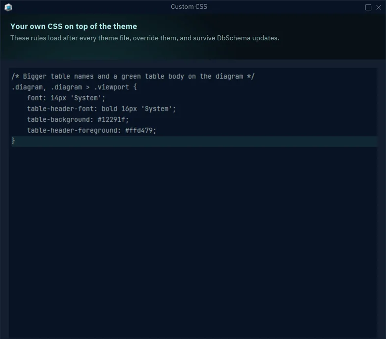
To try a change, open View → Theme → Edit Custom CSS. The dialog edits the user's custom.css, which loads after every theme file and survives DbSchema updates, and applies each change to the open windows. For example:

.root {
    -var-diagram: #181a1f;
    -var-tab-border-color: #e8b84b;
}

The Workspace

The DbSchema workspace in the dark theme, with numbered markers
#AreaVariable or ruleFileValue
1Window title bar-var-window-toolbar-bg, which is -var-diagrambase-dark.css#1e1e1e
2Menu bar-var-chrome-bg, used by .menu-bar. An open or hovered menu takes #2c3436.base-dark.css#262626
3Main toolbar-fx-base. The button labels use -var-muted, the icons .toolbar-button .glyph .text.base-dark.css#232323, icons #75a3a3
4Panels: structure tree, history, perspective-fx-base, which is also the ground of dialogsbase-dark.css#232323
5Regular text-var-text-color. Labels and cells under the mouse turn -var-hover-text-color.base-dark.css#d5d9de, hover #f2f5f9
6Muted text: tree headings, toolbar labels, counts-var-mutedbase-dark.css#8a929c
7Line under the selected tab-var-tab-border-colorbase-dark.css#51cdcd
8Tab that is not selectedGround -fx-base, text -var-mutedbase-dark.css#232323, #8a929c
9Diagram canvas-var-diagrambase-dark.css#1e1e1e
10Toolbar inside a panel-var-chrome-bg, used by .tool-barbase-dark.css#262626
11Ground of tables and grids-fx-control-inner-background, which is -var-diagram. Odd rows use -fx-control-inner-background-alt, 7% darker.base-dark.css#1e1e1e
12Selected row of a result grid-var-selection-cellbase-dark.css#1b2d3f
13Column header row-fx-body-color, which is -fx-basebase-dark.css#232323
14Dividers and borders-fx-text-box-border, also used for the border of text fields and buttonsbase-dark.css#323232
15License links in the toolbar-var-buy-now; the Trial label uses -var-buy-now-altbase-dark.css#51cdcd, #8586c7

The Diagram

The diagram properties are set in the .diagram block of theme-dark.css.

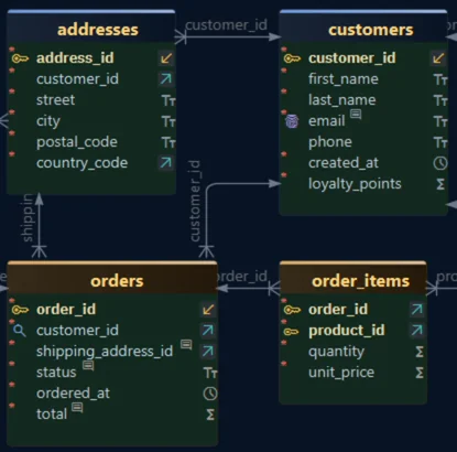
A table and a group can each be given a color in the model. DbSchema then paints them in the hue of that color, and takes only the lightness and the saturation from the CSS value. So the CSS value of a table header sets how light or dark every header is, and the table's own color sets whether it is blue, green or red. The properties that work this way are marked tinted below.

A DbSchema diagram in the dark theme, with numbered markers
#AreaPropertyValue
1Table bodytable-background#202020
2Table headertable-header-bottom-1 and table-header-bottom-2 (a gradient, tinted); the name uses table-header-foreground#363636, text #cacace
3Thin strip on top of the headertable-header-top-1 and table-header-top-2 (tinted)#de6d6d to #dda0a0
4Selected tabletable-background-selected (tinted); the name uses table-header-foreground-selected#355b79, text #dfdfdf
5Primary key columnName column-primary-key, key icon column-icon-pk-foreground#ecdcab, icon #e8b84b
6Column namecolumn-foreground#cacace
7Data type iconcolumn-data-type (tinted)#8a929c
8Dot marking a mandatory (NOT NULL) columncolumn-mandatory#d9635b
9Unique index iconcolumn-icon-unique-foreground#a98ce0
10Index iconcolumn-icon-index-foreground#6e9cd2
11Foreign key columnName column-foreign-key; the arrow icon column-icon-fk-foreground on the plate column-icon-plate-background#bfd6e4, icon #45b8b2 on #2b3038
12Foreign key line and its labelLine foreign-key, label foreign-key-text, line width foreign-key-line-width#6a6a6a, label #65696f, width 1.3
13Group nameLabel ground group-text-background, text group-text (both tinted)#4d8348, text #98c695
14Group areagroup-background drawn at the opacity group-transparency-value; border group-border-color, group-border-width (all tinted)#2c333b at 0.4, border #40b139, 2
15CalloutGround callout-background (a radial gradient), text callout-foreground, border callout-border-colorgradient #1a1a1a to #353941, text #b2d5cf

The SQL Editor and Its Results

The editor colors are set in the .code-editor block of theme-dark.css.

The DbSchema SQL editor and result grid in the dark theme, with numbered markers
#AreaPropertyValue
1Editor groundbackground, which is -var-diagram#1e1e1e
2Line numbersruler-foreground on ruler-background; the lines of the selection use ruler-selection-foreground on ruler-selection-background#8a9194; selection #cfd6d9 on #2b4152
3Line that holds the caretcaret-line-background; the caret itself caret-foreground#262d31, caret #ffffff
4Commentcomment-foreground#798a8a
5Keywordkeyword-foreground; keyword-bold sets whether keywords are bold#cc7832, false
6Stringstring-foreground#62b441
7Numbernumber-foreground#3398cc
8Plain text and identifiersforeground and identifier-foreground#a9b7bb
9Selected textselection-background. With selection-use-foreground: false the selected text keeps its syntax colors instead of taking selection-foreground.#2b4c66
10Status text of the result paneThe class .text-blue#89add1
11Column header row-fx-body-color, which is -fx-base (in base-dark.css)#232323
12Selected row-var-selection-cell (in base-dark.css)#1b2d3f
13Grid ground-fx-control-inner-background (in base-dark.css)#1e1e1e

Dialogs

Dialogs use the same .root variables as the workspace. Unless noted, the values are set in base-dark.css.

The DbSchema Edit Table dialog in the dark theme, with numbered markers
#AreaVariable or ruleValue
1Title bar-var-window-toolbar-bg, which is -var-diagram#1e1e1e
2Dialog ground-fx-base; the 1px outline of the dialog is -var-window-border#232323, outline #393939
3Label in front of a field-var-form-label, used by the class .form-label#8a929c
4Text fieldGround -fx-control-inner-background, border -fx-text-box-border, text -var-dialog-text-color#1e1e1e, #323232, text #e8ecf2
5Selected tabLine under it -var-tab-border-color#51cdcd
6Tab that is not selectedText -var-muted#8a929c
7Column header row-fx-body-color, which is -fx-base#232323
8Selected row of a table or tree-fx-selection-bar; when the table has no focus, -fx-selection-bar-non-focused#323232, #353535
9Check mark, and the arrow of a combo box-fx-mark-color#9cbcbc
10Pressed or selected toggle button-fx-pressed-base#0d2843
11Disabled controlNo color of its own: JavaFX draws a disabled control at reduced opacity.
12Default button (OK)-fx-default-button#2e404a
13Other buttonsGround -fx-body-color, border -fx-outer-border, which is -fx-text-box-border#232323, #323232

Menus

The menu rules are set in base-dark.css. The main menu uses them as well.

A DbSchema context menu in the dark theme, with numbered markers
#AreaRuleValue
1Menu ground and border.context-menu { -fx-background-color: #3a4145, #26292b; } — the first color is the border#26292b, border #3a4145
2Focused or hovered itemGround .menu-item:focused, text .menu-item:focused > .label#1f3a3a, text #e2ecec
3Keyboard shortcut.menu-item > .accelerator-text; in the focused item #9fb4b1#838b96
4Item icon.graphic-container .text. An icon that asks for a color keeps it, through the .color-* classes listed below.#5f9c93
5Separator.context-menu .separator:horizontal .line#33383b
6Disabled itemNo color of its own: JavaFX draws it at reduced opacity.

Other Settings

These settings have no screenshot. All values are those of the Dark theme.

Ground and Text Variables

Set on .root in base-dark.css.

VariableUsed forValue
-fx-accentSelected text in a text field#323232
-var-muted-hoverMuted links, and muted text on a welcome tile, under the mouse#d0d0d0
-var-edited-configName of a changed setting in the Settings dialog#77aaff
-var-row-hover-bgRow under the mouse in listsderive(-fx-control-inner-background, 12%)
-var-control-tray, -var-control-border, -var-control-hoverA control that sits inside a table cell: its ground, its border, its hover#2b2f36, #666d76, #3a4048
-var-window-borderOutline of dialogs and windows#393939
.hyperlinkLinks#51cdcd

Badges, Notes and Status

Set on .root in base-dark.css. Each badge color comes with a -border variant, the same color at 40% opacity.

VariableUsed forValue
-var-badge-accentAccent badge#35b6b6
-var-badge-successSuccess badge#a8c496
-var-badge-warningWarning badge#d9a05b
-var-badge-dangerDanger badge#e0a08c
-var-badge-neutralNeutral badge#9fb0c4
-var-status-ok, -var-status-warningStatus dots, and the colored edge of status rows#7fc0b5, #d9a05b
-var-note-bgGround of a note under a form field#d9a05b1a
-var-banner-bgGround of a highlighted strip, and of a selected source cardrgba(81,205,205,0.09)
-var-segment-chosen, -var-segment-chosen-textThe chosen segment of a segmented control#2c8f8b, text #0f1c1c
-var-switch-on, -var-switch-offTrack of an on/off switch#1f9a95, #3a4046
-var-switch-thumb, -var-switch-thumb-onKnob of an on/off switch, off and on#7c848d, #f2fbfa

Welcome Screen and Tips

Set on .root in base-dark.css.

VariableUsed forValue
-var-welcome-bgWelcome screen ground-var-diagram
-var-welcome-textThe selected database tile, its check mark, and the logo color#51cdcd
-var-welcome-button-bg, -var-welcome-button-borderTiles of the welcome screen#282828, #3a3a3c
-var-welcome-button-bg-hover, -var-welcome-button-border-hoverTile under the mousea radial gradient to #2c3c3c, border #51cdcd
-var-welcome-cta-bg, -var-welcome-cta-borderButtons of the purchase screen#454545, #5c5c5c
-var-bubble-fg, -var-bubble-dimTip bubble text, and its secondary text, step counter and close icon#dfe4ea, #949da8
-var-bubble-bodyText of the Quick Tour items#c6ced8
-var-bubble-accentTip bubble links and buttons#7fc0b5
-var-bubble-box-bg, -var-bubble-box-borderGround and border of a box inside a tip bubble#23262b, #3a424c
-var-bubble-ruleSeparator lines and step dots of a tip bubble#343a42

More Code Editor Colors

Set in the .code-editor block of theme-dark.css.

PropertyUsed forValue
type-foregroundData types#ffc166
delimiter-foregroundCommas, brackets and other delimiters#8a9499
reg-exp-foregroundRegular expressions#b64bce
find-backgroundA find hit#5c4a12
occurrence-background, word-backgroundOther occurrences of the word at the caret#453a5c, #31402f
error-foreground, warning-foreground, success-foregroundMessages in the editor#FF5A5F, #d9822b, #4cc46a
marker-find, marker-warning, marker-errorThe marks in the strip beside the scroll bar#c9a227, #d9822b, #FF5A5F
diff-added-background, diff-removed-background, diff-changed-backgroundLines in a text comparison#1f3a29, #3b2220, #1e2f47
diff-word-background, diff-conflict-backgroundChanged words, and conflicts#3c4a5a, #4a3419
prompt-text-foregroundPrompt text that the editor shows#7f8689

More Diagram Properties

Set in the .diagram block of theme-dark.css.

PropertyUsed forValue
table-shadow-effect, table-hover-shadow-effectShadow of a table, and of a table under the mousedropshadow(...)
table-corner-radius, table-border-width, table-border-colorShape of a table. The dark theme draws no outline; the border color still strokes the line under the header.6, 0, #333333
table-header-typeHeader style; 2 is the header with the thin strip on top2
column-foreground-hoverColumn name under the mouse#7cbae5
column-background-selected, column-background-highlightA selected column, and the columns highlighted by a relation#3e5062, #2b3038
column-virtual-foregroundA virtual column#c89ae0
foreign-key-virtual, foreign-key-deducedLine of a virtual foreign key, and of a deduced one#6f70bb, #4c7654
foreign-key-hover, foreign-key-selectedLine under the mouse, and a selected line#8c8c8c, #a47c00
group-border-selected, group-transparency-selected-valueA selected group#7086a5, 0.60
shape-foreground, shape-background, line-textShapes and lines drawn on the diagram#b2d5cf, #353941, #567a9b

Colored Text and Icons

Set in theme-dark.css and base-dark.css. The application puts these classes on labels and icons that must stand out.

ClassUsed forValue
.text-red, .text-green, .text-blue, .text-orange, .text-magentaColored label text#d6968e, #89d18a, #89add1, #d1b789, #ce64ff
.text-gray, .text-light-gray, .text-dark-grayGray label text#8a929c, #838b96, #929598
.color-green, .color-blue, .color-red, .color-orange, .color-teal, .color-purpleColored icons#7fc08a, #5992c0, #cc5f5c, #947e4e, #35b6b6, #c07fd0
.git-file-added, .git-file-modified, .git-file-conflicting, .git-file-untrackedFile states in the Git dialogs#7fc08a, #8ea2ff, #e0736b, #838b96
.sync-exists, .sync-missing, .sync-changedRow grounds in the schema synchronization dialog#26402b, #2f1409, #3d3a1f
.browse-frame-barTitle bar of a table in the Data Explorerlinear-gradient(to right, #0f2a3f, #141e26)