Reports & Application Designer
Introduction
Using the Reports and Application Designer, you can create reports and applications for the Web, based on the Bootstrap responsive framework. The designer makes it possible to create complex pages using tableviews, charts, and buttons, show dialogs and navigate between pages.
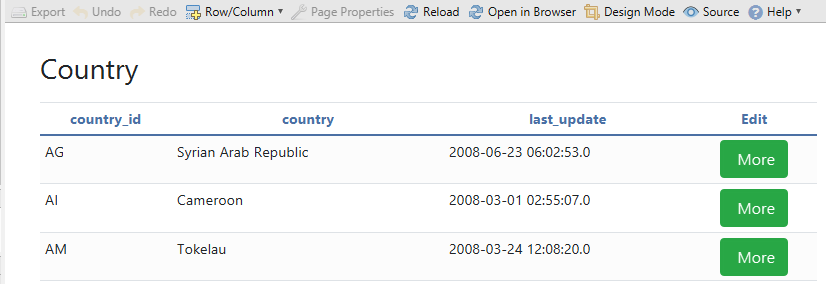
After starting a new project by the reverse engineer from the database, DbSchema automatically creates a sample layout with tools. One of the tools is the Analytic Application. Here is an example:
Pressing the design-mode button in the toolbar, will mark the designer cells. Each cell may contain one component.
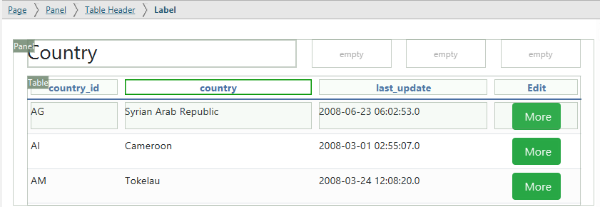
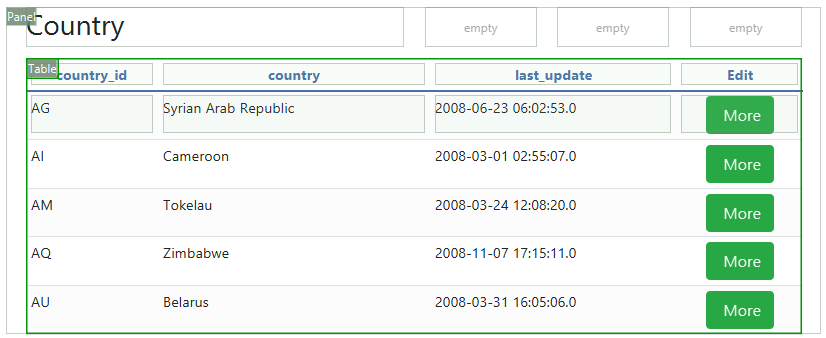
The page contains one pane and one tableview. The tableview cell has been merged to the right with the other cells. The tableview has its own cells.
On the top there is a breadcrumb, showing the current selected cell and its variables.
Edit Components
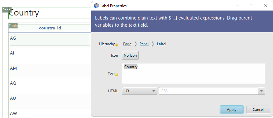
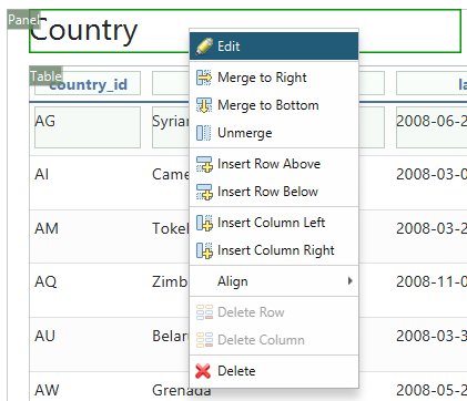
Cells can be edited by double-clicking them. Here we edit the 'Country' title table.
Labels can use different templates ( H1, H2, H3, Span ) and Bootstrap CSS Styles.
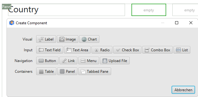
Double-click an empty cell to create a new component.
Add Rows, Columns and Merge Cells
Rows or columns can be added.
Cells can be merged with the empty cells to the right. The merge option is available in the cell context menu.
Edit the Tableviews
Tableviews are embedded components, having their own cells.
Clicking the 'Table' green label we can edit the tableview properties.
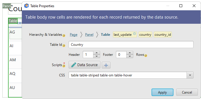
In the properties dialog we can set the number of header and footer rows.
The body row is showing multiple times in the output, one time for each row returned by the data source script.
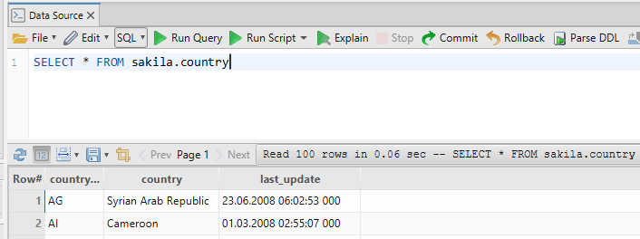
By pressing the 'Data Source' button, we can edit the table data source script. The data source can be an SQL or a Java Groovy statement.
In the next image, the first cell 'id' is in the table header. Below it, the cell has the text '${id}.
Expressions like ${...} are evaluated, returning the variable value.
Labels can combine flat text with evaluated expressions, like 'Value=${value}'
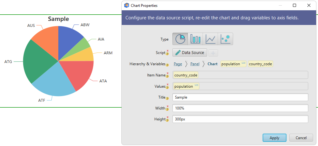
Charts
Charts have also a data source script. After editing the script, you can configure the chart axis (item name and values), by dragging variables from the breadcrumb.
Create a Master-Detail Report
The report below is a master-detail report. The master tableview shows the records from the Country table, the detail from the database City table. The master tableview has two rows in the body: one contains labels for ${country_id}, ${name}..., and contains the detail tableview. The cell containing the detail tableview has been merged to the right.
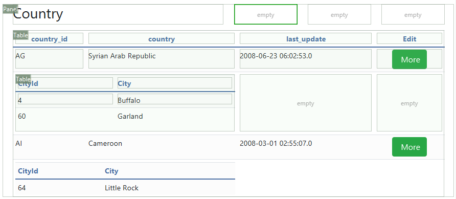
The data source scripts are:
MASTER:
  SELECT country_id, name,... FROM country
DETAIL:
  SELECT * FROM city e WHERE country_id=${country_id}
The detail tableview data source is executed for each record from the master tableview. The ${country_id} is replaced with values from each record returned by the master tableview data source script.
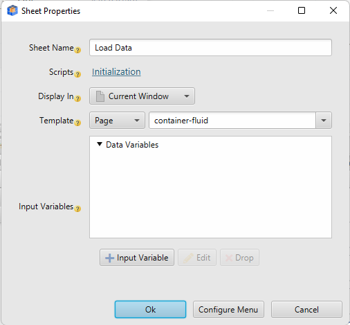
Add Interactivity Between Pages
Using buttons or anchors you can open other pages or dialogs. The button can send also variables to the target page, including values from text fields, radio buttons, or custom configured values.
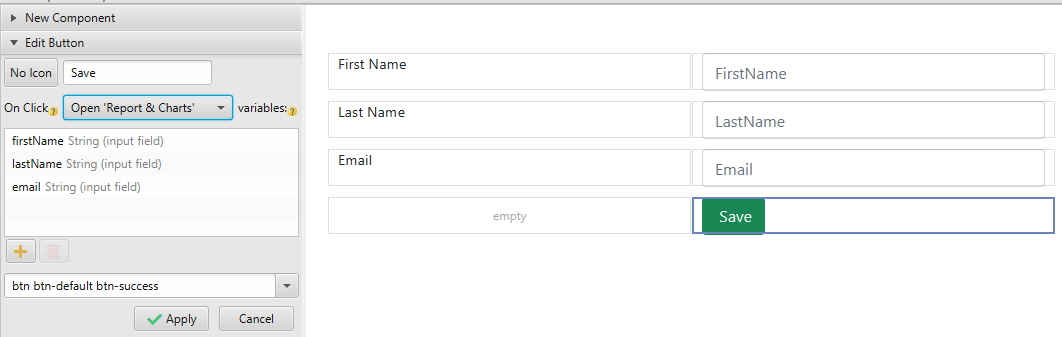
In the target sheet, using the Form Properties from the menu, we can set an Initialization Script and input variables. The initialization script can be used to save the variables into the database. Check the Help / Automation Code Samples dialog for code examples. The input variables are used to make sure certain variables are present when accessing the sheet. If missing, we can set an error message.
Start the Report Server
The applications can be exported from the Designer menu as .dbsr files. They can be executed as a stand-alone reports server using 'DbSchema.exe -r report.dbsr'.
Deploy Reports on Tomcat Server
The reports can be deployed as Tomcat WAR applications and can run independently. You can export the created application under any tomcat instance.
- Download and install Tomcat. The installation file is usually a zip file that you have to unpack. Go to the 'bin' folder and execute 'startup.bat'. This will start the tomcat server. This may request to set the JAVA_HOME variable pointing to your current Java installation folder. Do this by pressing the 'Win' key ( with the Windows logo ) + Break, then 'Change settings' / 'System properties' / 'Environment Variables'. After setting JAVA_HOME you will have to close and reopen the command prompt and execute again 'startup.bat'.
- Edit the tomcat-users.xml file from the tomcat conf folder.
<role rolename="tomcat"/> <user username="tomcat" password="tomcat" roles="manager-gui"/> - Restart the Tomcat server.
- Login on 'https://localhost:8080' and follow the link 'Manage App'. There you can upload the generated war file.
- Browse to 'https://localhost:8080/war_file_name'